|
My go big piece is somewhat satisfactory. While for the most part, I like how it looks in terms of colors, shading, and neatness, it does leave a bit to be desired. It contains a large amount of negative space, the shading on the pool at the bottom could be improved to quite a defined extent. Overall, it's one of my better pieces, but could be improved greatly.
0 Comments
I feel pretty about this piece, ignoring the major flaws. The colors are pretty vibrant and it looks nice over all. The problems of this piece, however, are abundant. To start it off, the pencil lines are still visible, both the outline and the lines from the points to the building. Secondly, the variety of color was less than extensive. It only really had hues and shades of blue, yellow, green, brown, and red. Third of all, the drawing on the back bleeds through the page, taking away from the piece. Fourthly, some of the objects look odd and misshapen, most likely due to their 3-dimensional shape, not being rectangular or square. Finally, the background is a bit off, whereas I tried to add areas of dirt, farmland, or just city blocks, they ended up looking like strange floor squares. The sky didn't fare well either. The clouds look out of place and cut-out. To summarize, I think it looks okay, but it has many flaws that hold it back from being better than it is.
My general feeling about this piece was that I wasn't able to completely finish it. I was in favor of the general direction it was going, but there were some parts I had some notes on. For example, the brush strokes didn't fit together, and you could tell that some parts of the piece dried before I was able to lay down more watercolor. Also, I wasn't able to completely remove the charcoal outlines of each object. All in all, I was feeling conflicted on the state it was in, but feel it could have ended well.
This piece, at least to me, seemed to feel rushed. You can easily see the brush strokes from the water color in the ocean and in the orchid-colored space. I felt like the stars were not as good as they could be, as many of them took on a square shape. I don't really like how the moon looks either, it looks sub-par and done quickly. In the entire piece, there is very little fluent gradient, as all shading looks like it was done in waves or coats. I do, however, like the way the clouds and land look; I think the shading looks alright in their own respective ways. I'm not to keen on the sun though; the pencil outlines are still there and trapped underneath the water color, so they can't be erased. All in all, this is pretty much what I expected from my No Experience Piece.
To start this off, I am not as proud of this as I could be. I feel as though I drew it a bit off balance and disproportionate. I feel as though the markers were a bad choice. The intensity of their color did not allow for me to add subtle shading or colors that were more muted, pale, subdued, or pastel. I feel like it also limited the amount of detail I could add, as the thickness of the tip of the marker wasn't very slim at all. I also didn't really have the chance to add more of a background or to add more words. At times, it felt like it looked rushed, and I still do. The shirt looks weird because it is not evenly shaded, and neither is my face or neck. There was also a limit of the number of colors accessible to me. There wasn't really a way to mix or layer colors. To finish this up, I don't like the way markers look. I will probably not be using these felt tip markers again. 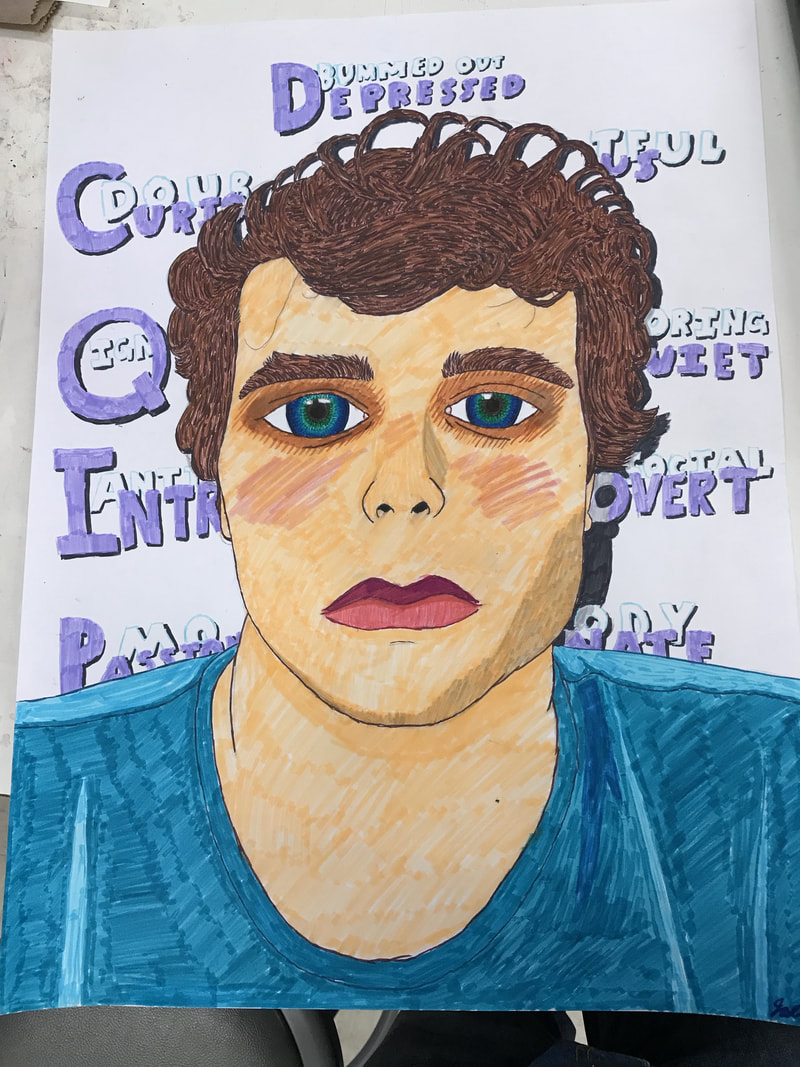 |
AuthorWrite something about yourself. No need to be fancy, just an overview. Archives
January 2018
Categories |
 RSS Feed
